Red brick may cover most of your home's exterior, but it doesn't need a coat of paint to look different. Change the trim around it, the siding above it, or the garage door beside it, and the whole front can read differently.
For exterior paint colors that go with red brick, start with a soft white or a muted greige on the largest paintable area. Then use a darker green, charcoal, or navy on a smaller feature. The right choice depends on the brick, mortar, roof, and how much contrast you want to see from the street.
See how two palettes change where you look
We made an illustrative red-brick facade from a Roomvana example photo, then used the same generated view for two paint concepts. The examples show where a color sits on the house. The named paints further down are separate starting points to sample in person.
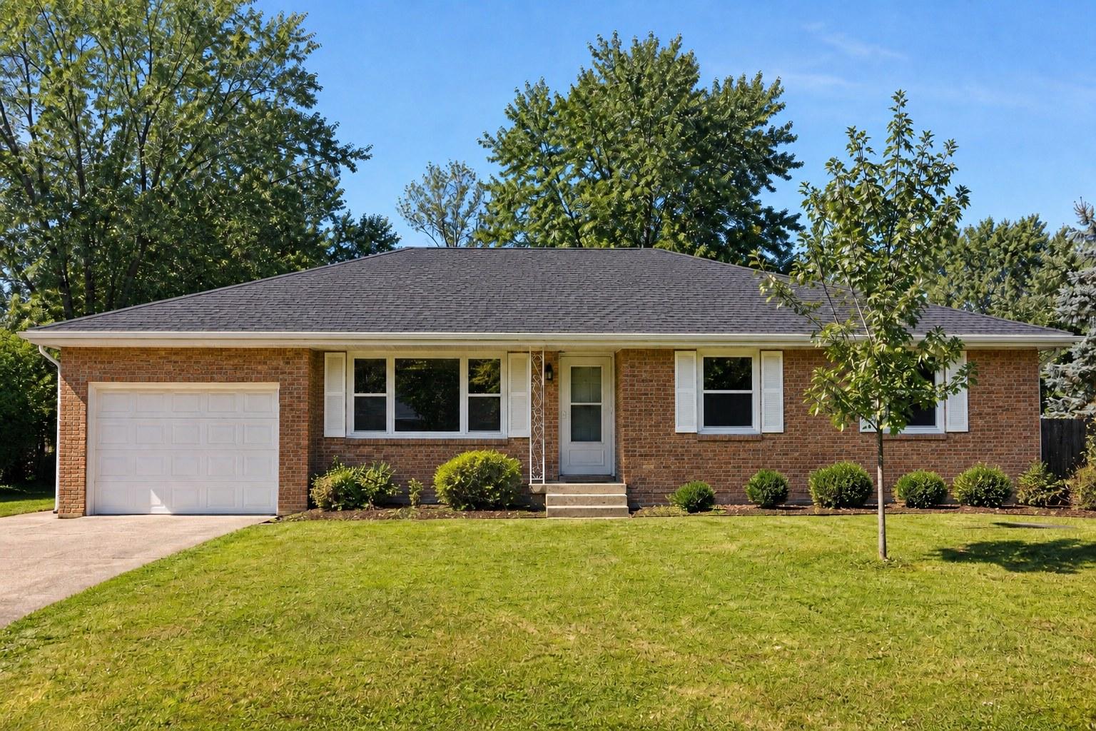
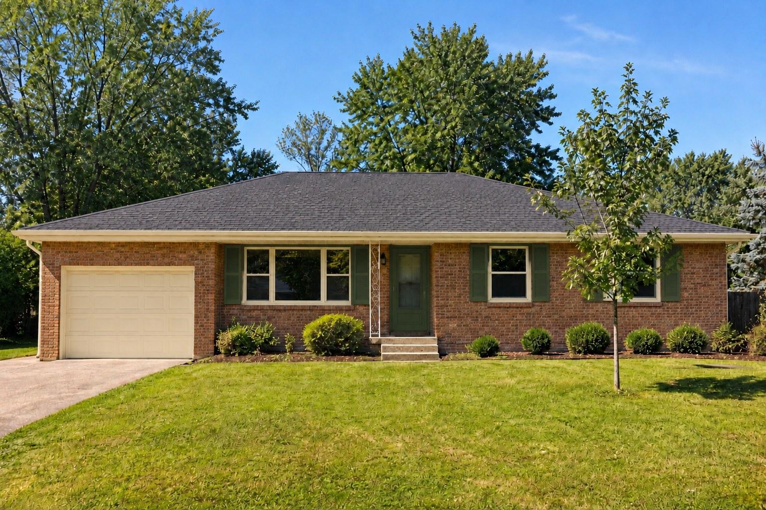
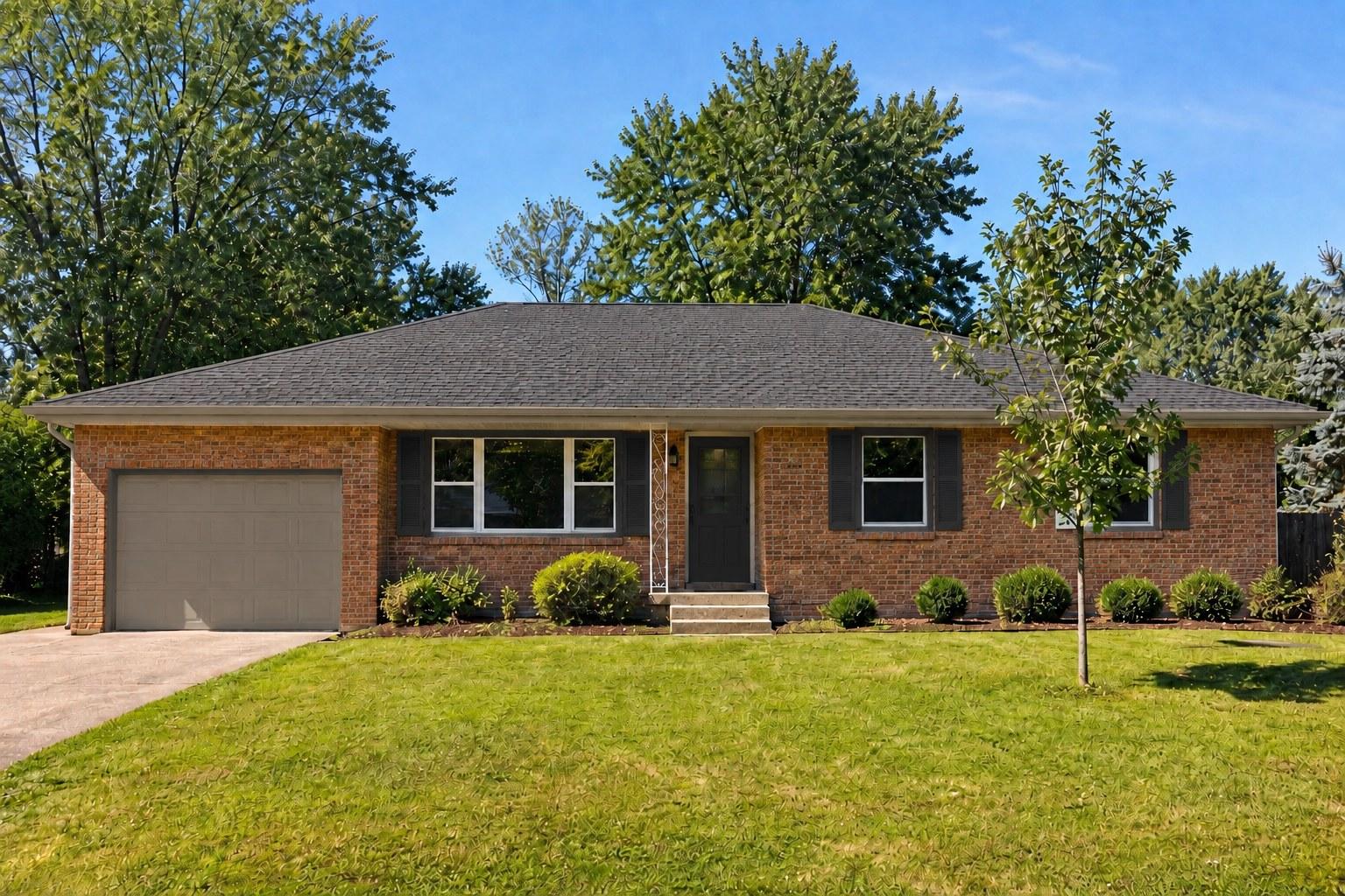
In this example, we'd start with a taupe garage sample if the garage feels too prominent from the street. If you like the lighter outline around the house, keep that role for cream and use olive on the door or shutters.
Start with the surfaces you plan to keep
Stand far enough back to see the roof and garage as well as the brick. Make a note of four things: the brick's range of colors, the mortar, the roof, and any siding or window frames that won't be repainted. Brick often contains several reds and browns; choose colors that work with the whole wall, not one particularly bright brick.
Next decide which area should carry the lightest color and which should be the accent. A garage door can occupy as much visual space as a large wall. If you want the entry to lead the composition, sample the garage in the siding or trim color and reserve the darkest color for the door.
Three starting palettes for the same red-brick house
These are starting combinations, not tested matches for every brick. The fixed starting point is an imagined house with unpainted red brick, a medium-gray roof, light mortar, painted upper siding, a garage door, and a front door. The palettes change the paintable surfaces while keeping that setting constant. The colors are real manufacturer colors; the combinations and surface assignments are our editorial proposals, not photos of completed projects.
| Direction | Upper siding and garage | Trim | Front door | What to check |
|---|---|---|---|---|
| Soft and light | Sherwin-Williams Alabaster SW 7008 | Alabaster | Iron Ore SW 7069 | Does the light siding feel too bright beside the mortar? |
| Quiet green | Alabaster | Alabaster | Pewter Green SW 6208 | Does the green still feel distinct in the shaded entry? |
| Stronger contrast | Pewter Green | Alabaster | Iron Ore | Is the dark upper siding too prominent against your roof? |
The first two palettes keep the largest painted areas the same, so the choice is mostly about the entry. The third moves green onto the upper siding and garage; it makes a much larger commitment. If the garage dominates the front, compare a lighter garage door with the dark one before choosing.
Prefer blue? Try Benjamin Moore Hale Navy HC-154 on the door in the first palette. See it beside your roof and brick before deciding: a color name alone doesn't tell you how it will behave on your house.
Where should each color go?
Trim: A soft white gives windows and porch details definition. A greige closer to the mortar can make those outlines quieter. Test both directly beside brick and mortar; a tiny chip held in isolation won't show the relationship.
Siding: For a partial-brick house, siding is a large color field. Light siding gives the brick a clear edge; a deeper muted green gives the upper facade more visual weight. Check the transition where the two materials meet.
Garage: Match it to siding or trim when you want it to recede. A darker garage is an intentional focal point, so view it from across the street with the front door in sight.
Front door and shutters: A dark, muted color can draw attention to the entry. If you have shutters, test them with the window frame as well as the brick; you don't have to paint shutters and door the same color.
Roof: Treat an existing roof as a fixed color. A warm brown roof may change your preference between a warm neutral and a cool charcoal. If a replacement is already planned, compare it with the whole palette using a roof color visualizer.
Test your shortlist outside
- Choose two candidates for the largest painted surface and one or two for the door. Get physical samples and use sample boards or an appropriate test area, following the paint supplier's directions.
- Place each sample against the brick and mortar, then next to the actual siding or trim it may cover. Look in direct sun and shade, and return at another time of day.
- View the boards from the street. A trim color that looks subtle up close can create a much stronger outline around every window.
- Before ordering, check the chosen product is suitable for each substrate and exposure. Color and coating are separate choices.
A digital preview is useful for comparing the *placement* of light and dark. Upload a front-facing photo to the exterior paint visualizer, then compare its suggestions with physical samples. AI previews are approximate: they may change surfaces you intended to keep or render a named color inaccurately. They aren't a paint specification.
Pick one light and one dark direction, place the samples where siding meets brick, and look at them from the sidewalk before buying all your exterior paint.